Project Overview
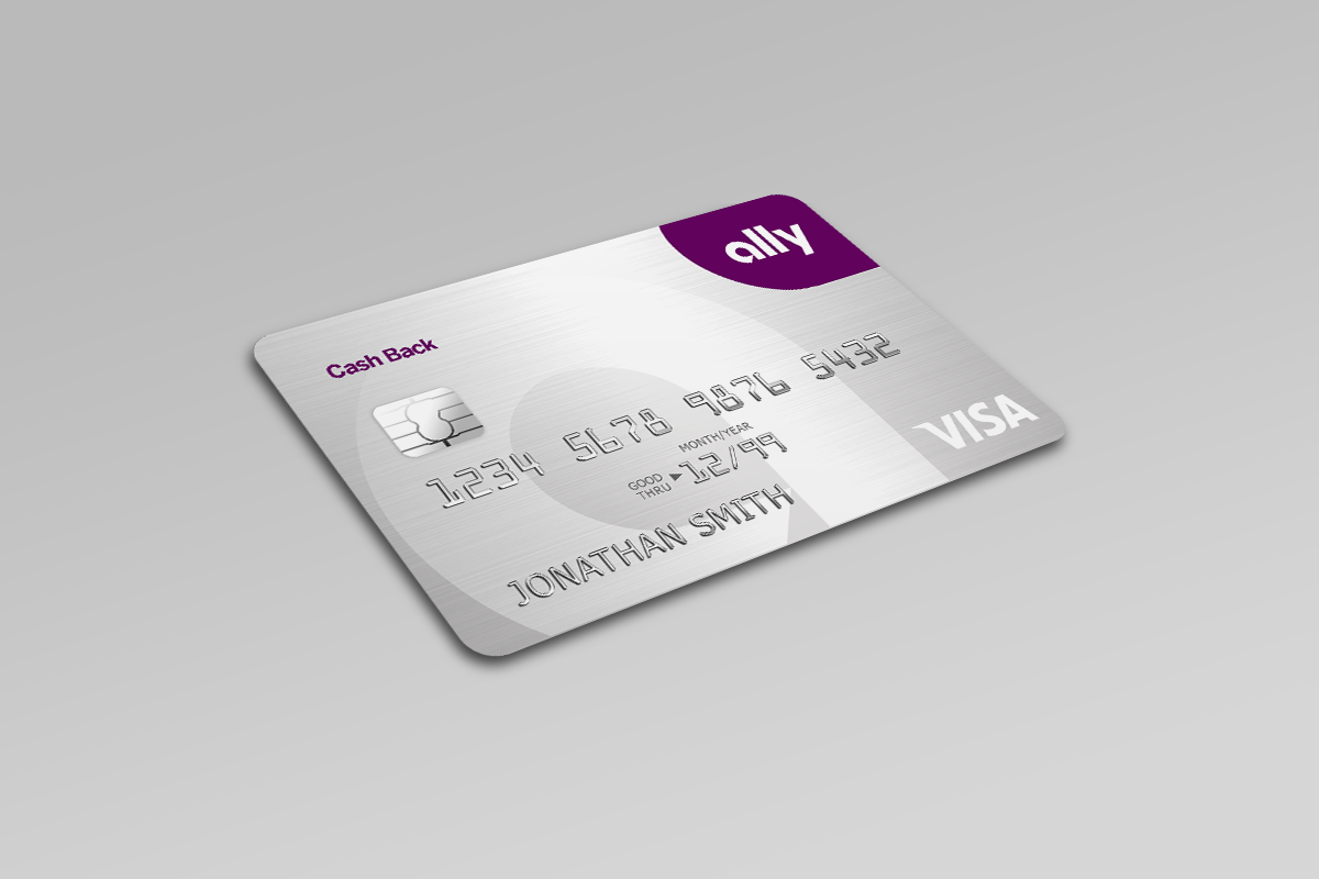
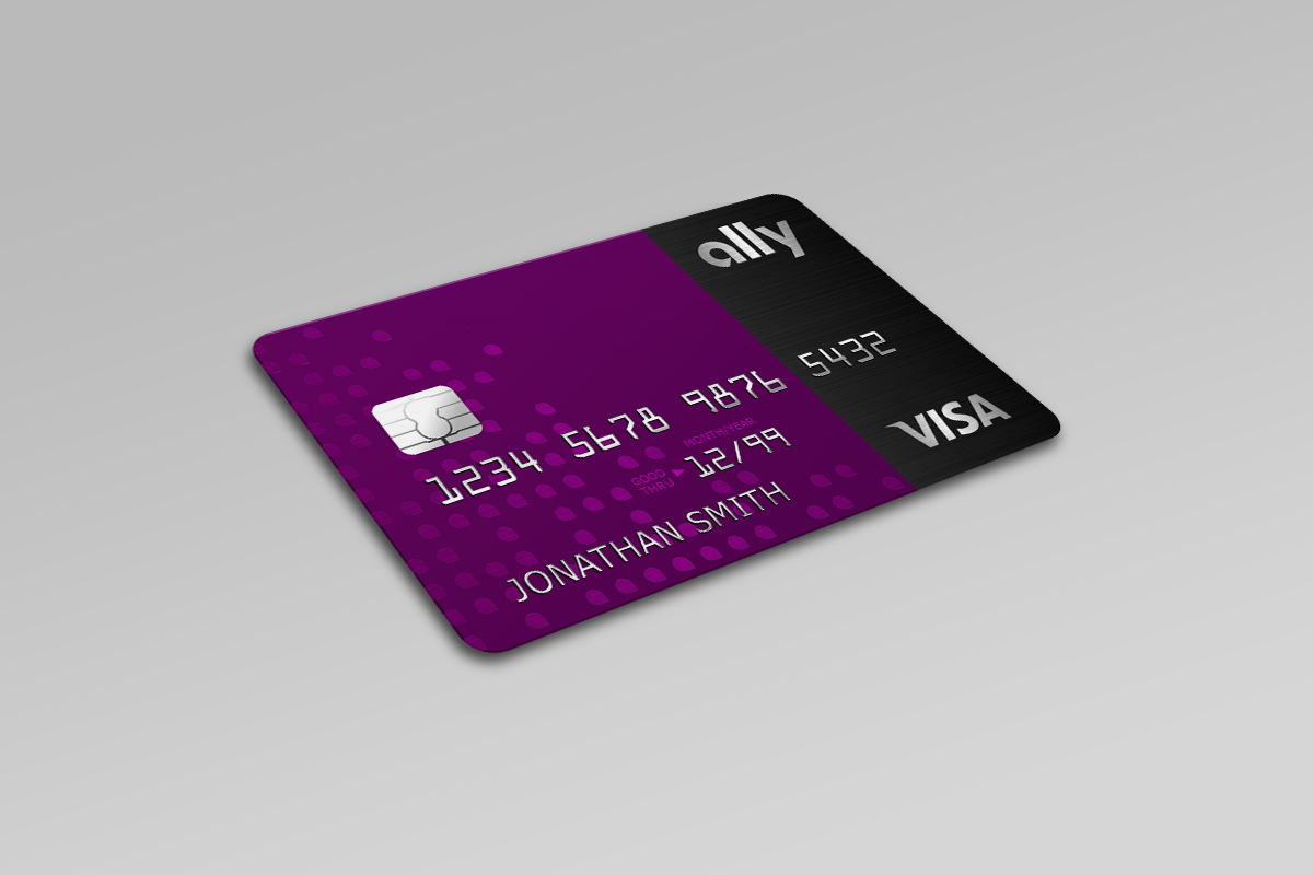
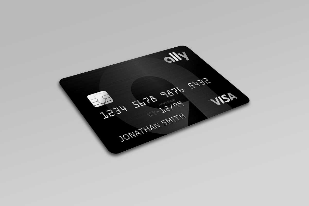
My contract at Ally was the first time I was able to make the official jump into a new professional world called User Experience Design. Ally had partnered with TD Bank and was planning to release their first ever credit card. My team was assigned design and integrate the entire user experience centered around this card. This included building a responsive landing page for the card with all of the necessary promotions and legal disclosures, designing an interactive calculator to drive user engagement, building an online application form for the credit card, integrating contact information for card holders throughout the existing Ally site, and the design of the physical card itself.
Full Case Study: coming soon…
Additional Project Details
This project really set a high bar for my first official UX project. The team was excellent and worked extremely well together. The company was committed to and had developed the proper structure for excellent, user-centered design work. We were able to utilize an on-site user research lab with moderators who specialized in gathering unbiased feedback. Finally, our team had full access to an amazing in-house Engineering team who were also totally bought in to the vision and success of the product.
Our UX team met multiple times a week and hashed out concepts as a unit rather than just siloing tasks out by skill set. We began with a competitive audit to familiarize ourselves with how our competitors were speaking about and presenting their various credit card offers and included a round of testing to see what customers liked or disliked about what certain cards were offering or how they were being marketed and then used all of this data to develop our strategy moving forward.
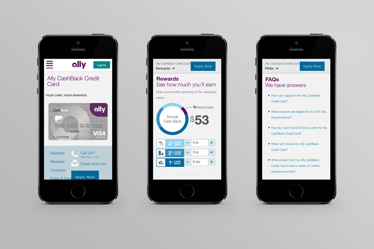
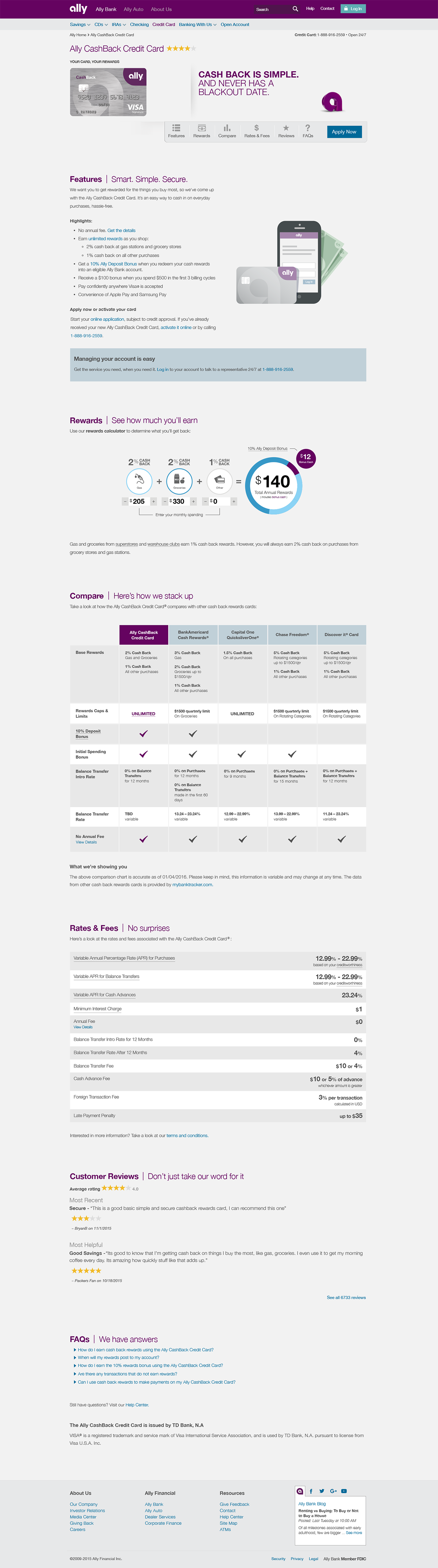
The results of our research showed that potential customers prioritized very specific pieces of information relating to credit card offers and we used this prioritization to determine the hierarchy of the page. Thanks to the wealth of information gathered in our user research, laying out the page became relatively easy. During this phase I worked on several pieces of the product including low fidelity wireframes for both mobile and desktop, high fidelity mockups of these same pages including the various illustrations that were included (another item we were able to A/B test), and finally mockups showing where contact information for cardholders could be contained within the existing infrastructure of the Ally website.
Once we had the basic page design finished, the final piece of this project was designing the interactive rewards tool. This got multiple rounds of user research to see if and how users would choose to interact with the various designs. In the end, we designed a very simple rewards calculator that highlighted the main benefit of the card and helped customers visualize how much they could potentially earn with their specific purchasing habits. The final step was to put the finishing touches on the rewards calculator by adding some subtle motion to help customers understand how to interact with it. This added motion got one final round of testing before the page went into development.