Project Overview
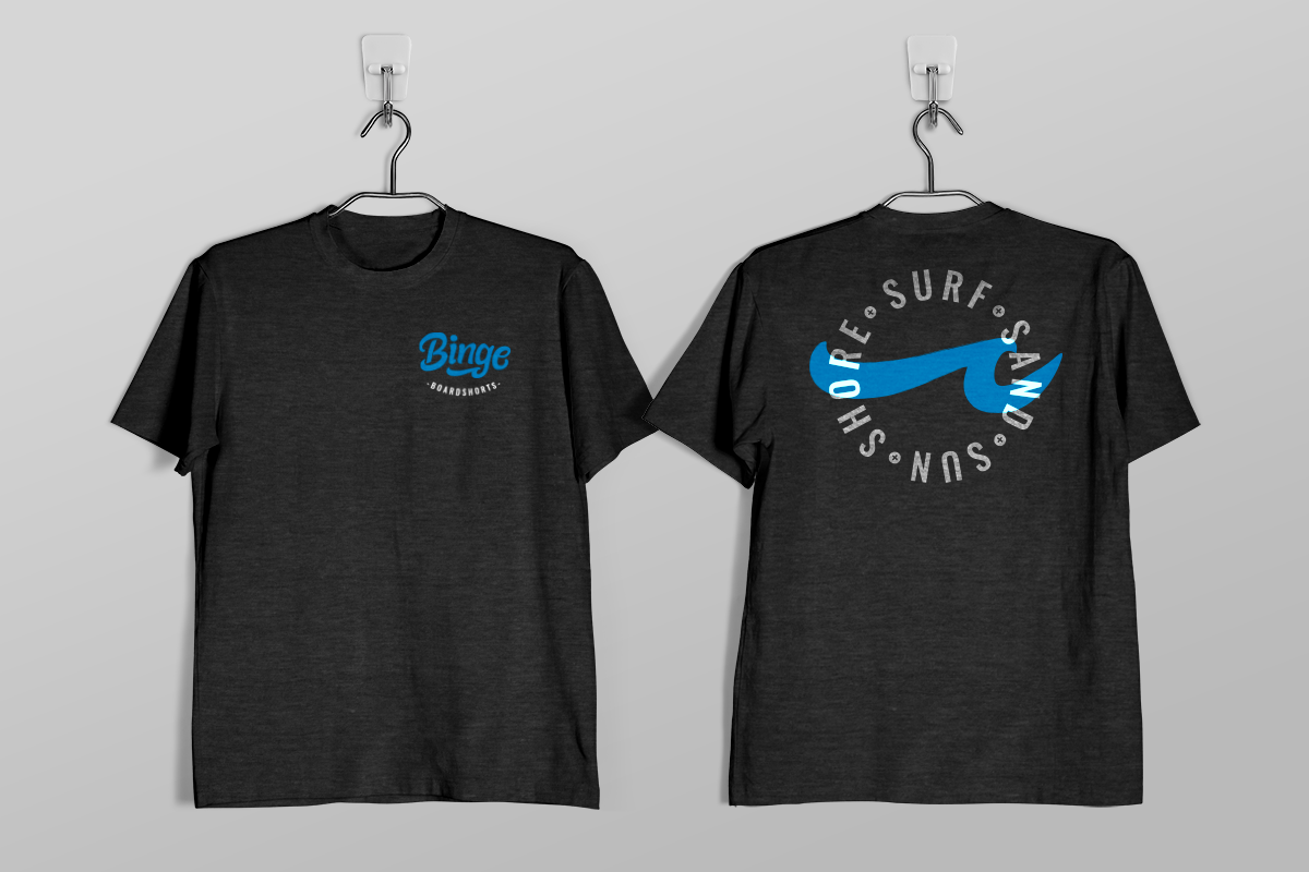
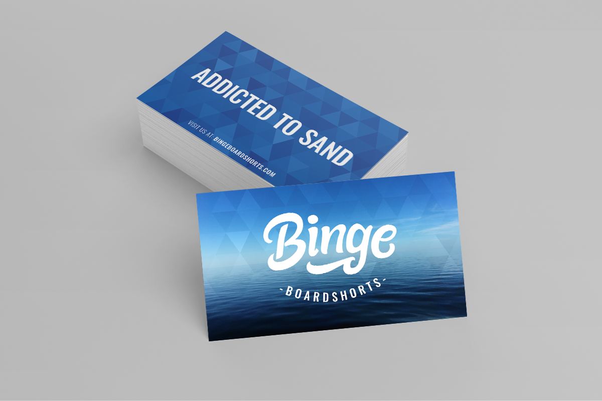
A good friend of mine from the beach volleyball community approached me about his idea for a new company that designed and developed board shorts for competitive athletes. In the spirit of the intense drive these athletes possess he had settled on the name “Binge Board Shorts.” After an audit to determine what his vision was for the company branding – I realized the logo mark we created needed to have an organic feel to help soften the word “binge” and bring a fun element into the brand. To accomplish this, we worked with a graffiti artist online to develop the unique typeface. I refined a final version of the logo to incorporate the wave shape in the “g” and we ended up with a unique brand identity that I feel met his needs.