Project Overview
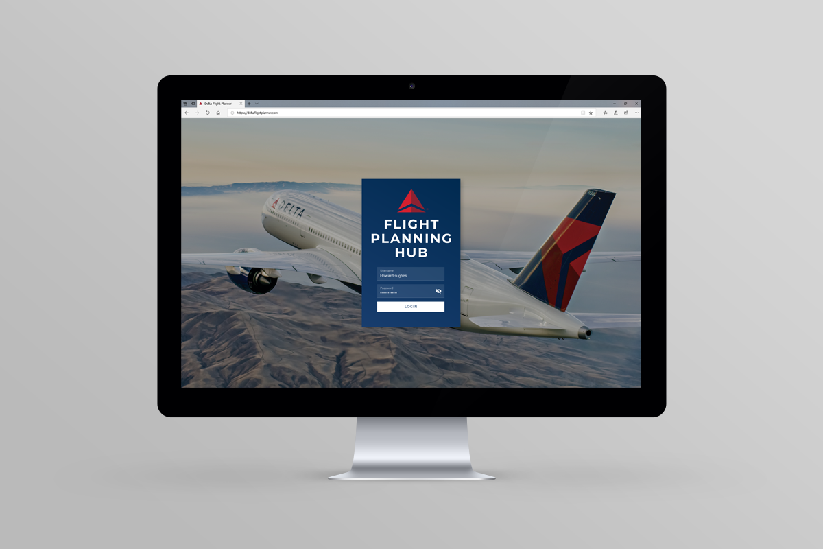
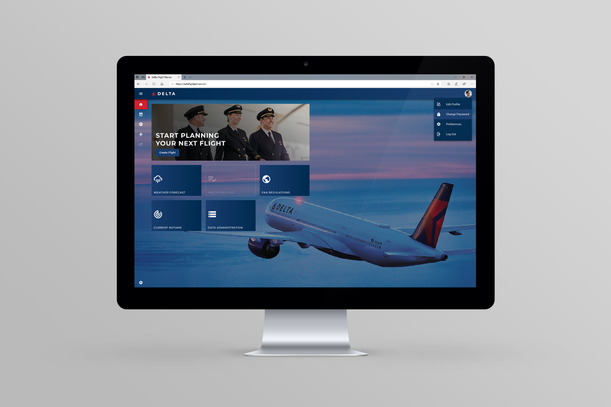
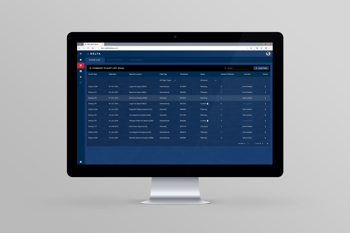
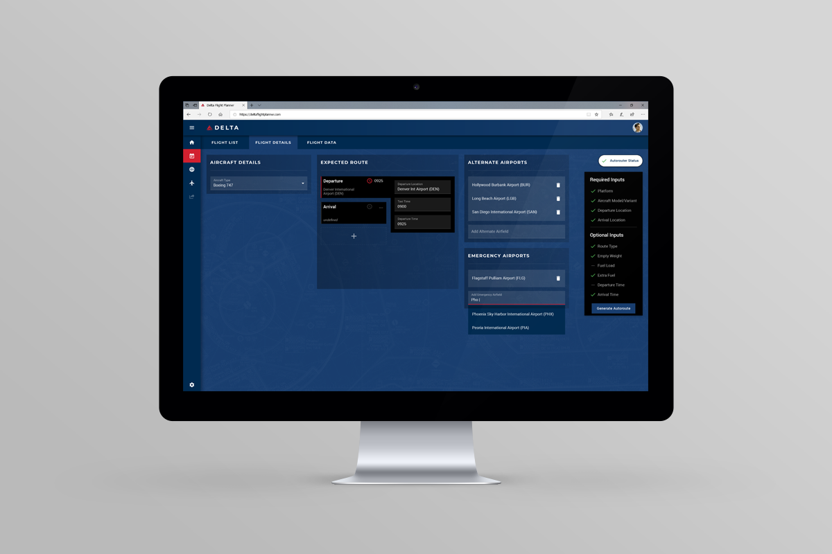
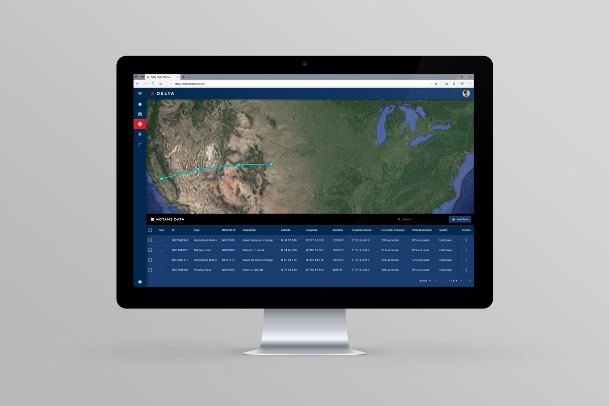
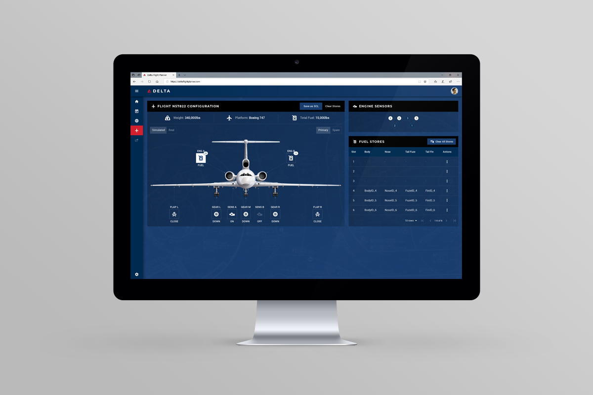
This project was the main area of my focus during my time at GTRI. It was a multi-year, joint effort by the Air Force and Navy to create a collaborative Mission Planning interface. Much of the early ground work had been completed by the time I began working on the project, which was both a blessing and a curse. Early on my role focused primarily on wireframe creation but I ended up transitioning into visual patterning and component library creation after the first year. The screens you see below represent an MVP version of the product that the team created in an effort for get buy-in from broth branches and create a cohesive visual language that could be disseminated to all eleven engineering teams.
Full Case Study: *available upon request due to security constraints
UX Style Guide: Download PDF
Additional Project Details
This project had been ongoing for several years before I became involved with little tangible product to show for quite a bit of effort across the board. It eternally suffered from the waterfall approach taken by both the Air Force and the Navy often because they were un-aligned on the larger vision of what we were attempting to design. It did not help that it had begun as a Navy project (that many on their side and our side felt had been completed many years ago), then morphed into a joint effort with the Air Force, and then changed into separate efforts between the two branches in a competition to create the better product.
Just onboarding to the current status of the project took a couple of months. Our UX team and the various Engineering teams spread across both the Navy and Air Force decided the most effective strategy would be to try and design and develop an MVP version of the product so we could all work from the same starting point and catalyze some forward momentum. The UX team worked through previous iterations of the wireframes to update and streamline them based on the new requirements captured from both branches. This project also suffered from a lack of leadership because each project manager was on a very different page and any requirements that were written, often conflicted or contradicted previous ones.
After we had tepid buy-in on the wireframes, the eleven Engineering teams proposed using Google Material as a cohesive visual design system. My role became dissecting the available components the Material Design System offered and attempting to customize them and force them into our interface, certainly not the best way to got about it but I understand the desire to have some common ground that all of the Engineering teams could use. After I created the UX Style Guide, I produced high fidelity mockups of several key wireframes to stress test how well the Material components could meet our needs.
This project was, and I assume continues to be, a perfect example of how NOT to conduct a UX project. Still, I consider all of the shortcomings to be important lessons and I am proud of some of the incremental progress I was able to make in the face of severe constraints. I am especially proud of my audit, documentation, and conversion of the entire Google Material Design System and remain hopeful that perhaps it still serves as a ground truth for the project.